
Carvana Illustration System
Illustration is a key component to Carvana’s brand ownable assets. There was sizable room for opportunity, however, to continue expanding upon the existing repertoire and curate a more intentional system. This case study will take you through the entire journey—from initial full-scale brand asset audit, to the eventual positive impact the newly established system had on Carvana’s product space.
CLIENT
Carvana
TYPE
Illustration + Product
TEAM
Visual Design - Robert Diep
Product Design - Katy Cook

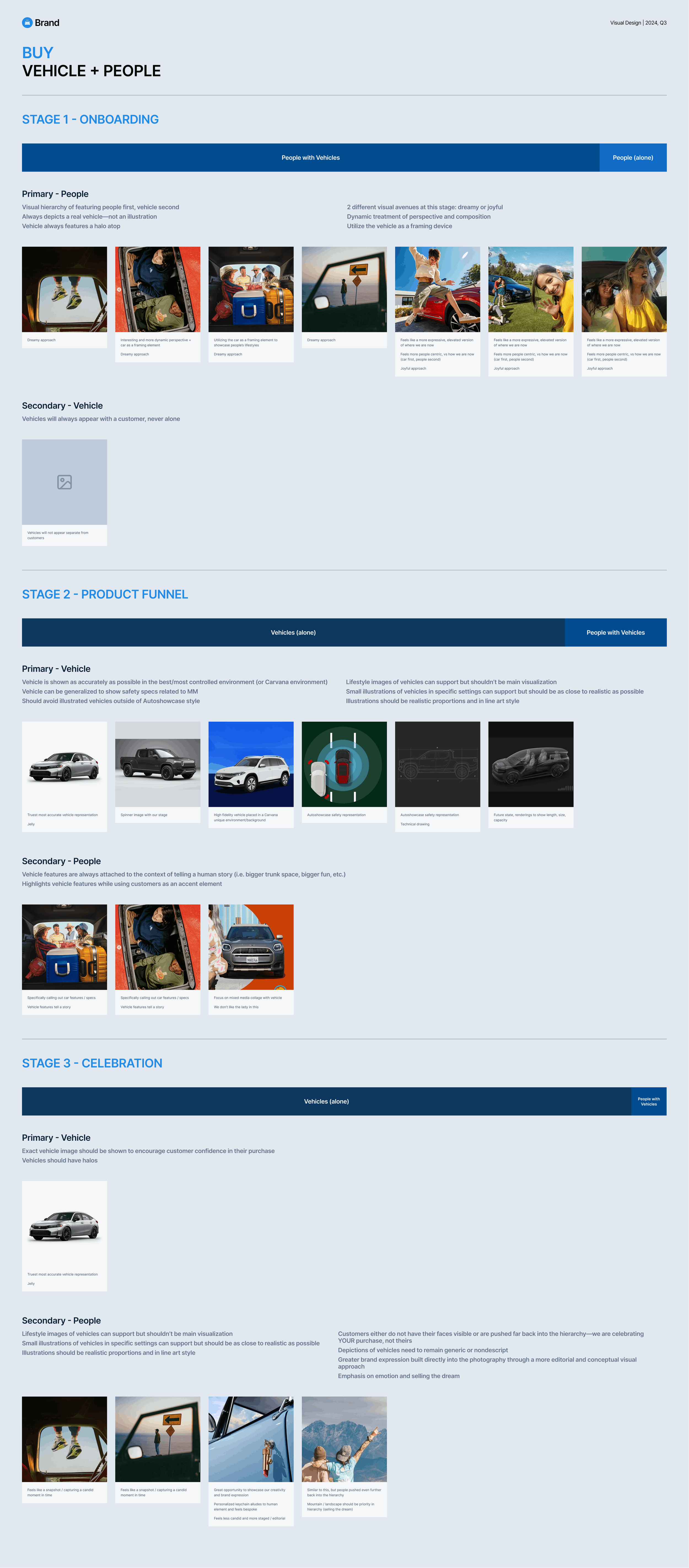
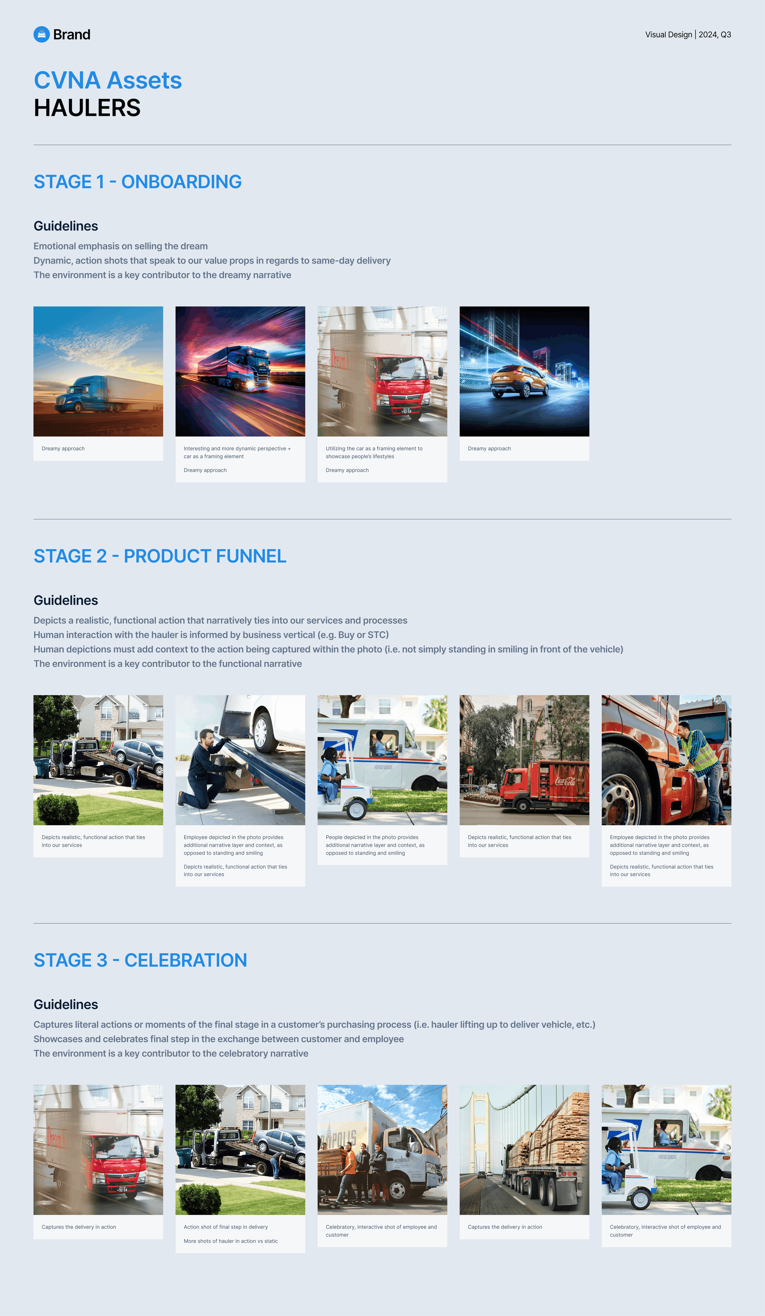
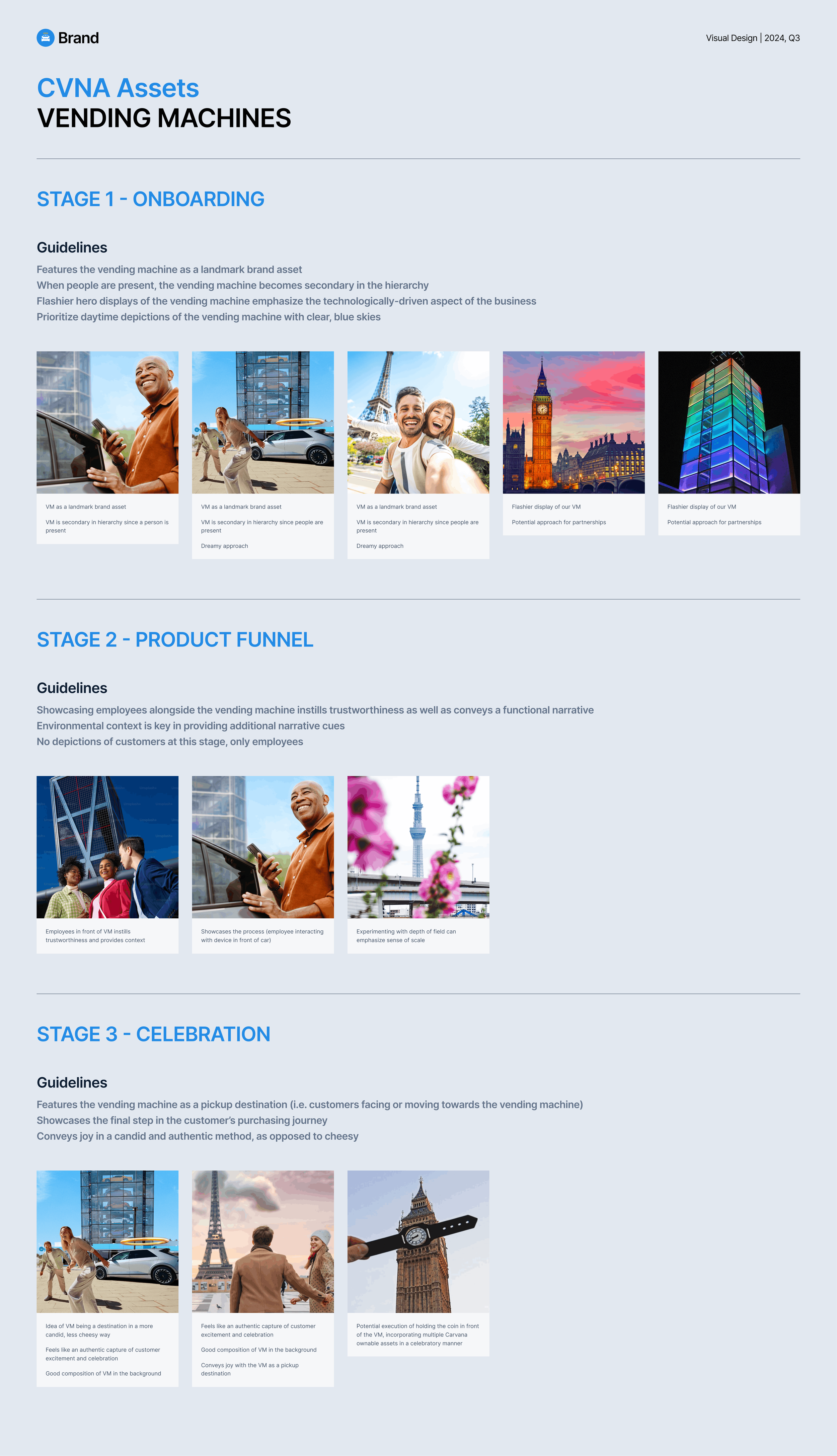
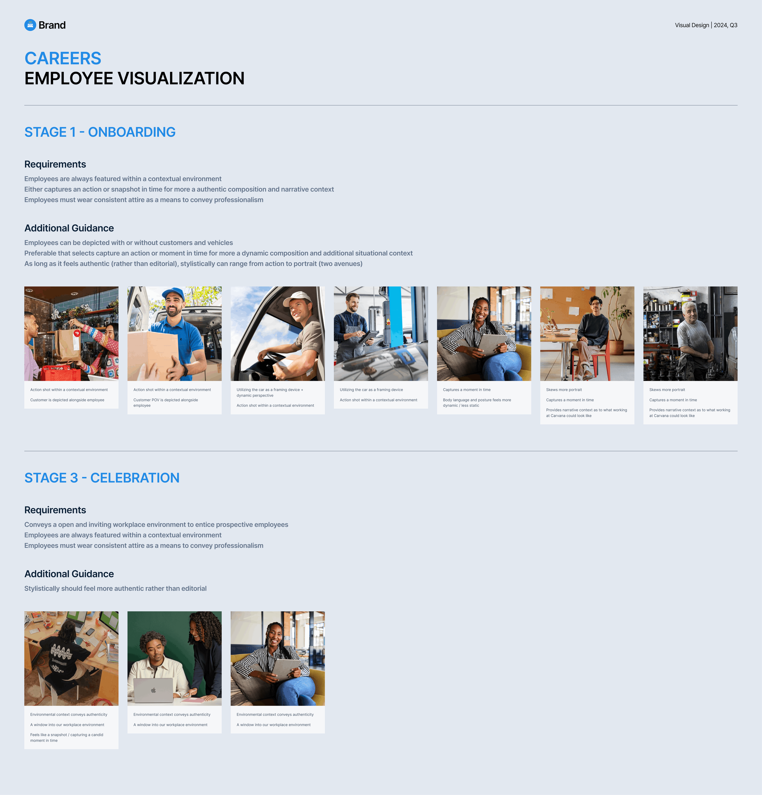
BRAND AUDIT
We conducted an extensive audit of Carvana brand assets across all aspects of the business in order to gain a full-bodied understanding of our gaps. After months of sifting through assets and carrying out visual mapping exercises based upon north star key attributes, we were able to distill and bucket our brand assets into digestible style sheet visualizations with usage guidance and guardrails.
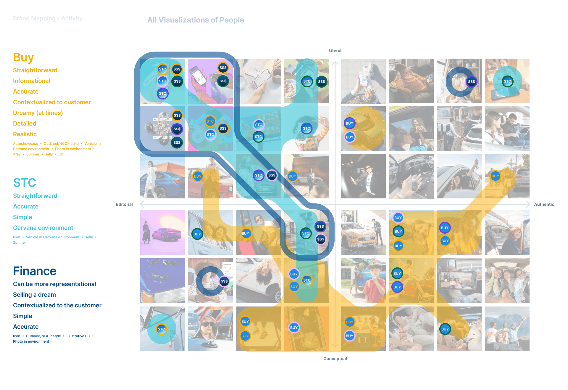
VISUAL maPPING
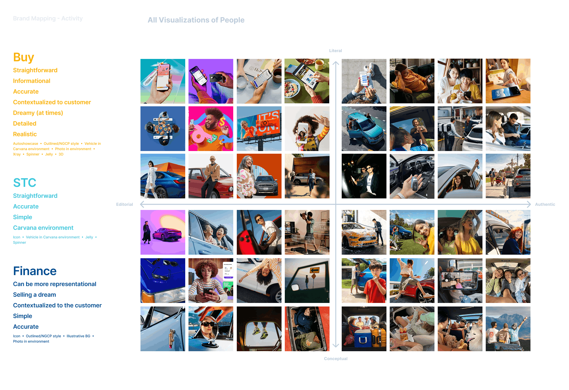
We used a visual asset mapping methodology to set the vision for our brand asset direction, as well as assess alignment between the Visual and Product Design teams. Overall this exercise reinforced the importance of balancing authenticity with brand storytelling to create a consistent brand POV.
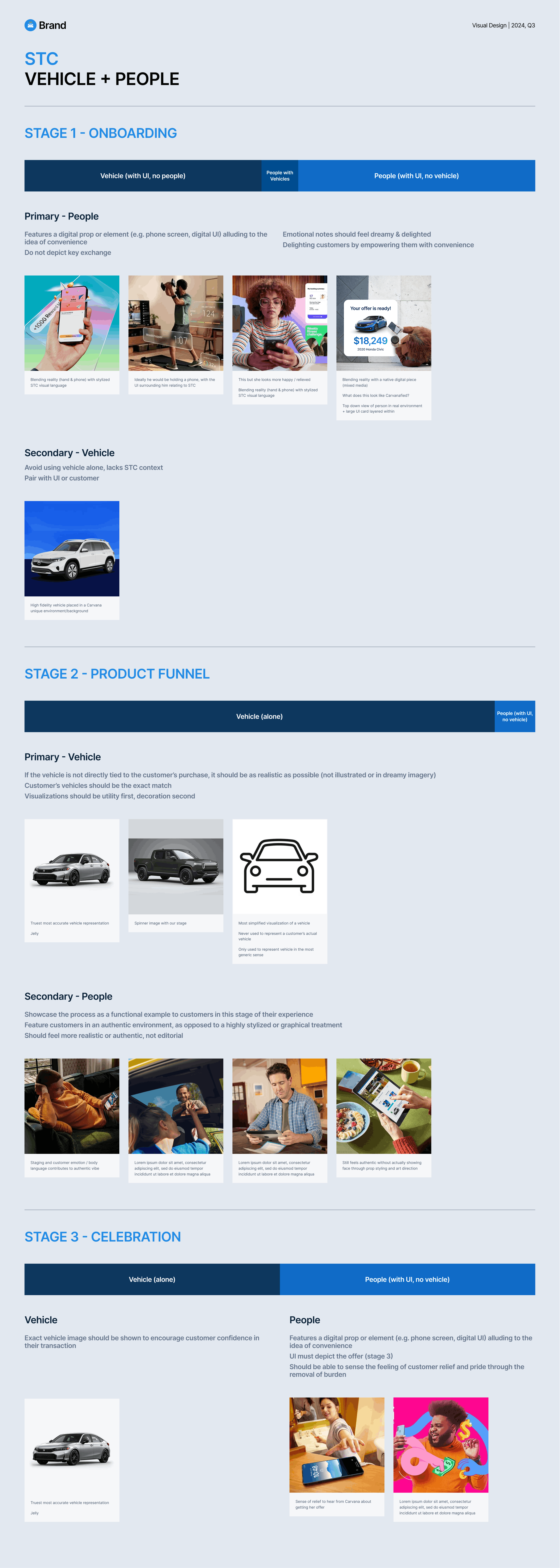
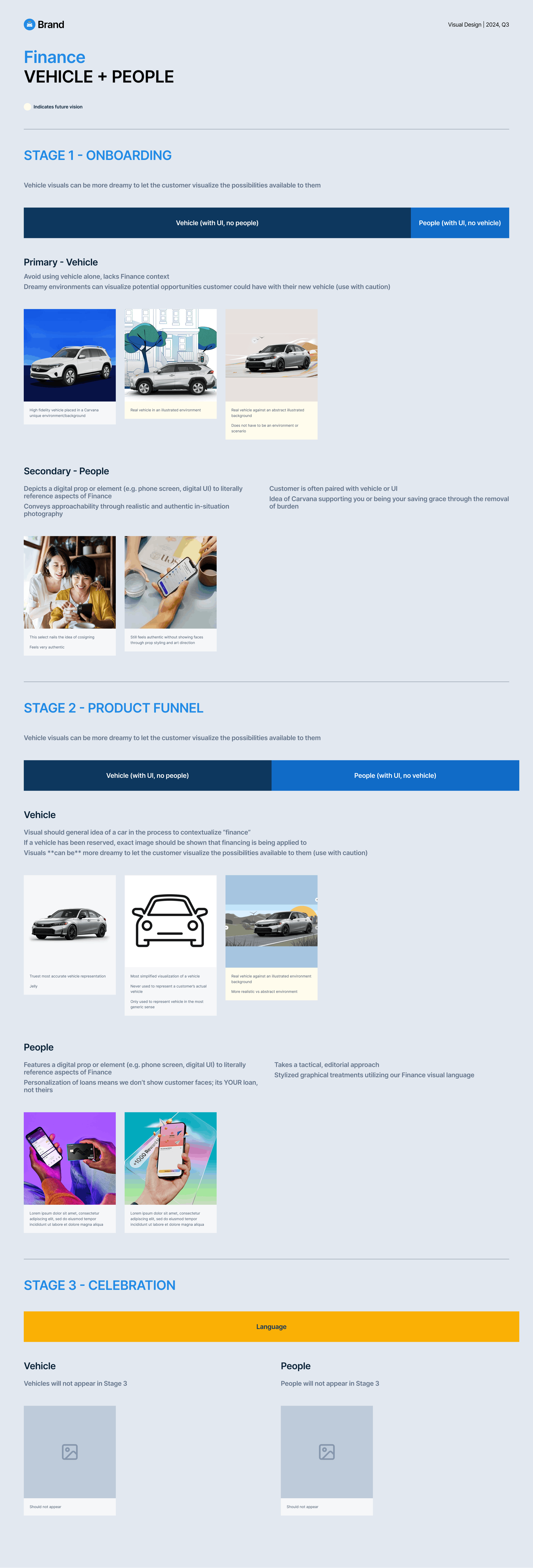
STYLE SHEETs
Taking what we learned from the visual mapping exercises, style sheets for each business vertical and main brand asset type were created to provide concrete usage guardrails and visual guidance.
DISTILLATION
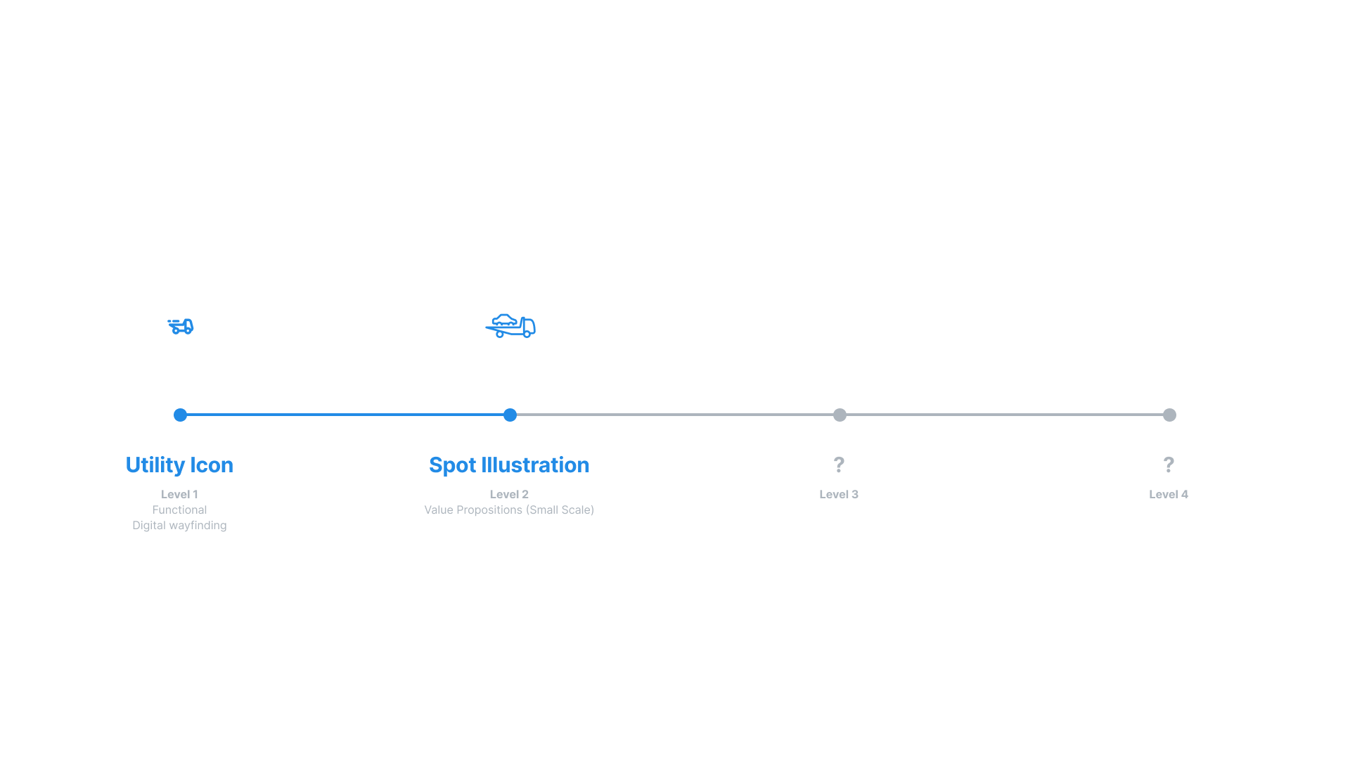
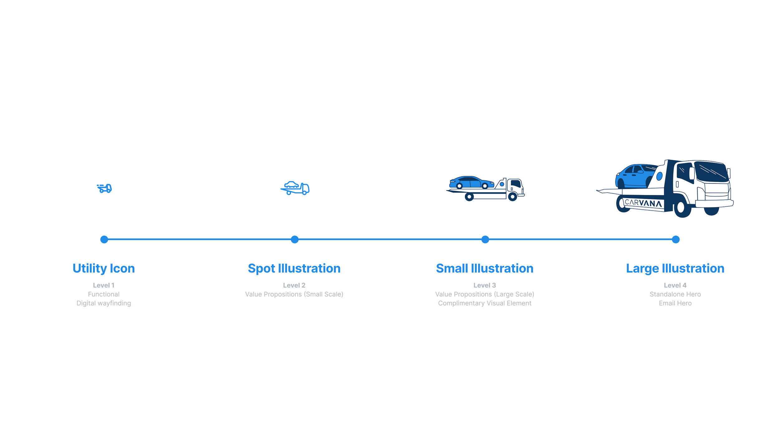
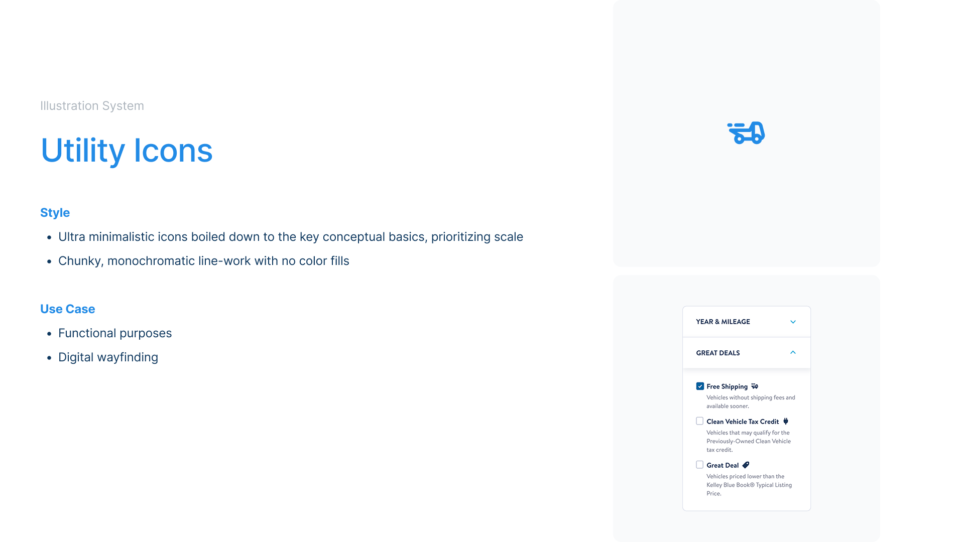
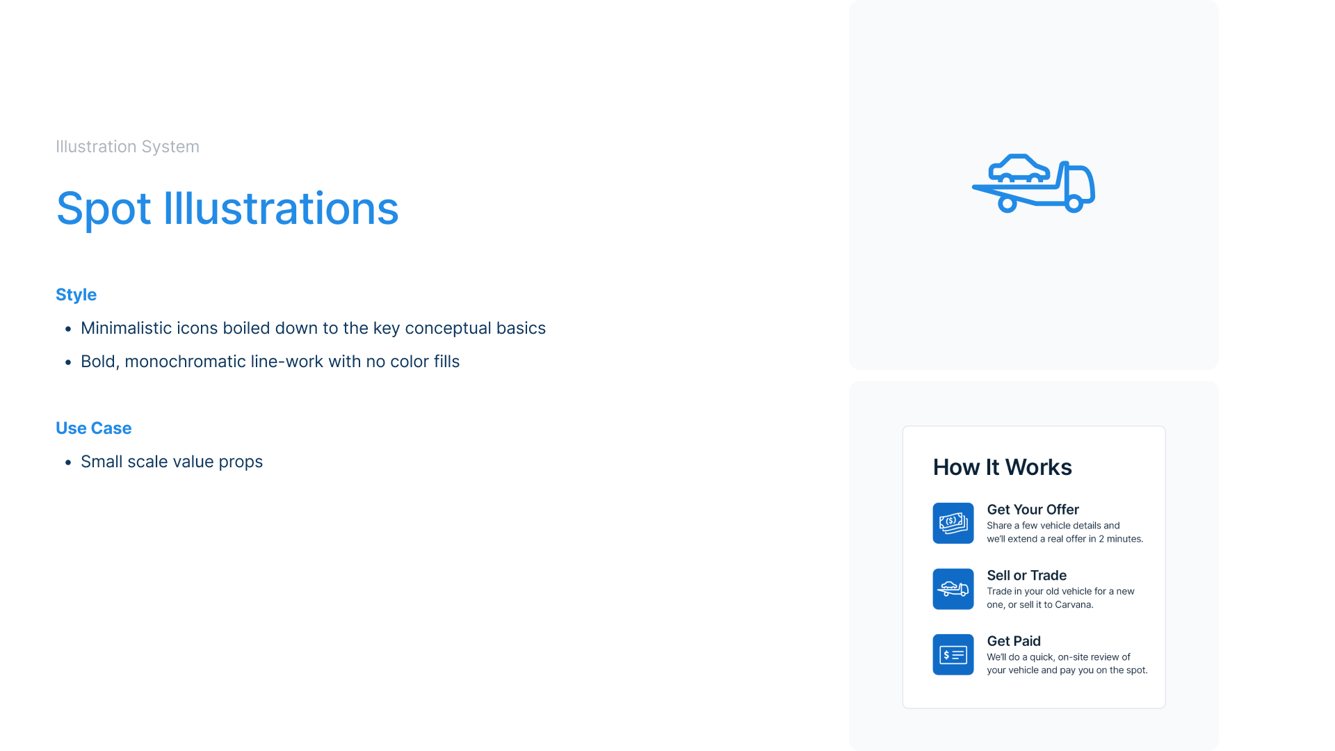
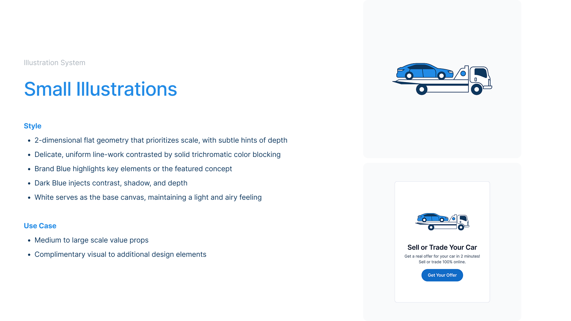
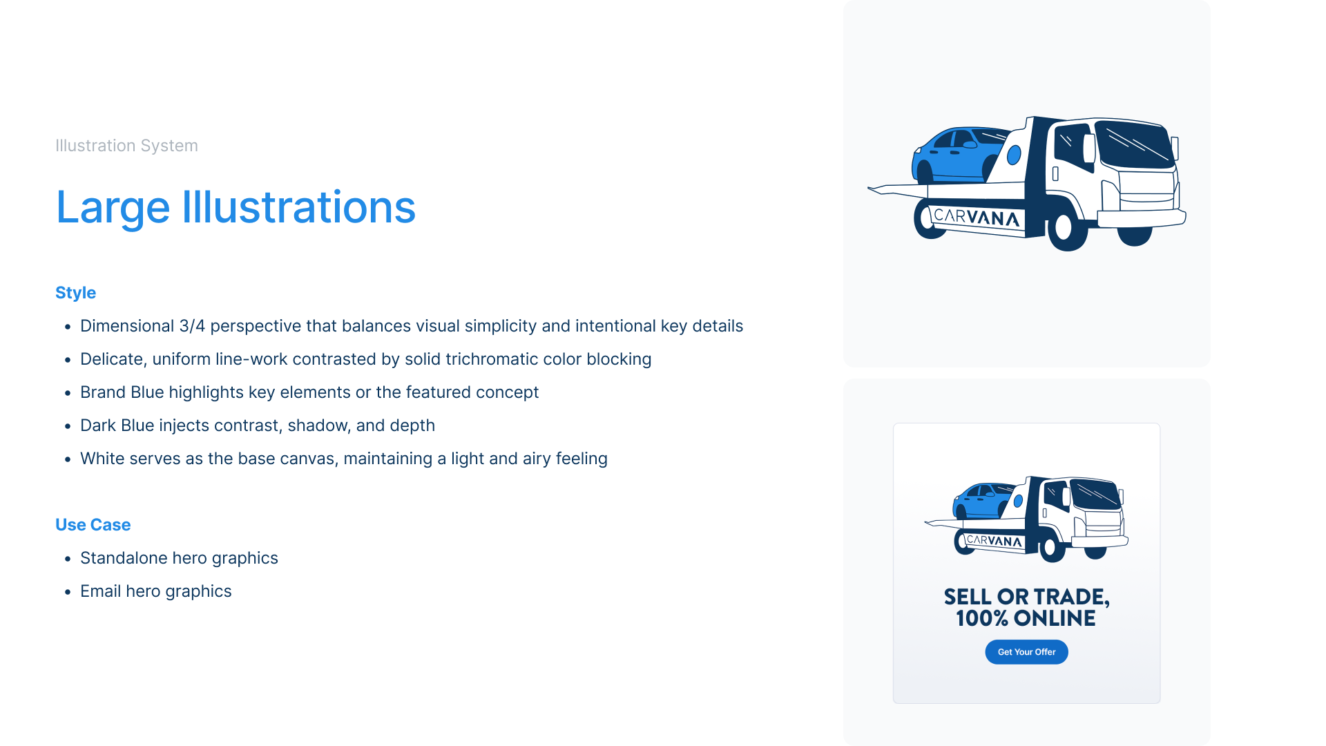
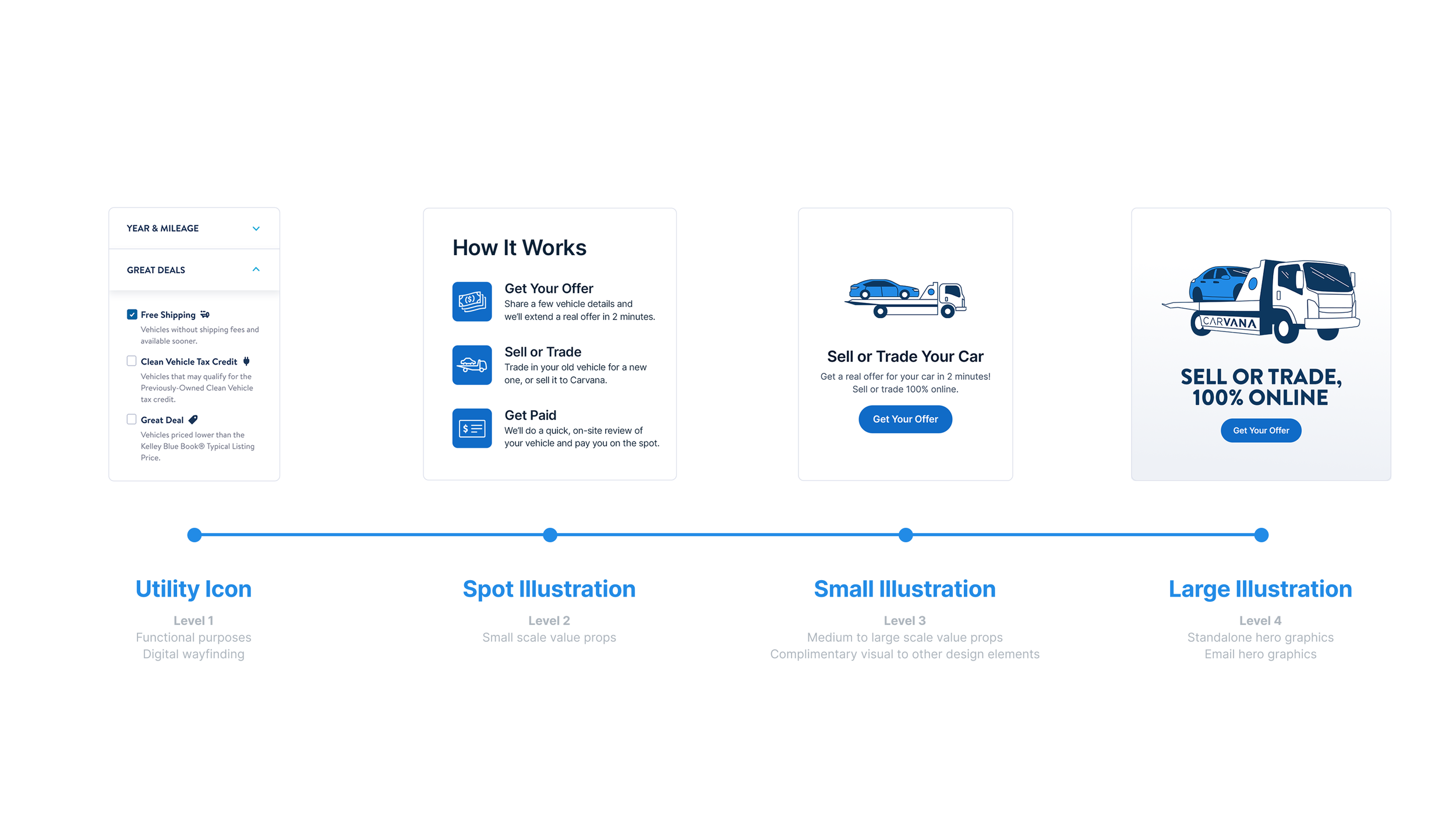
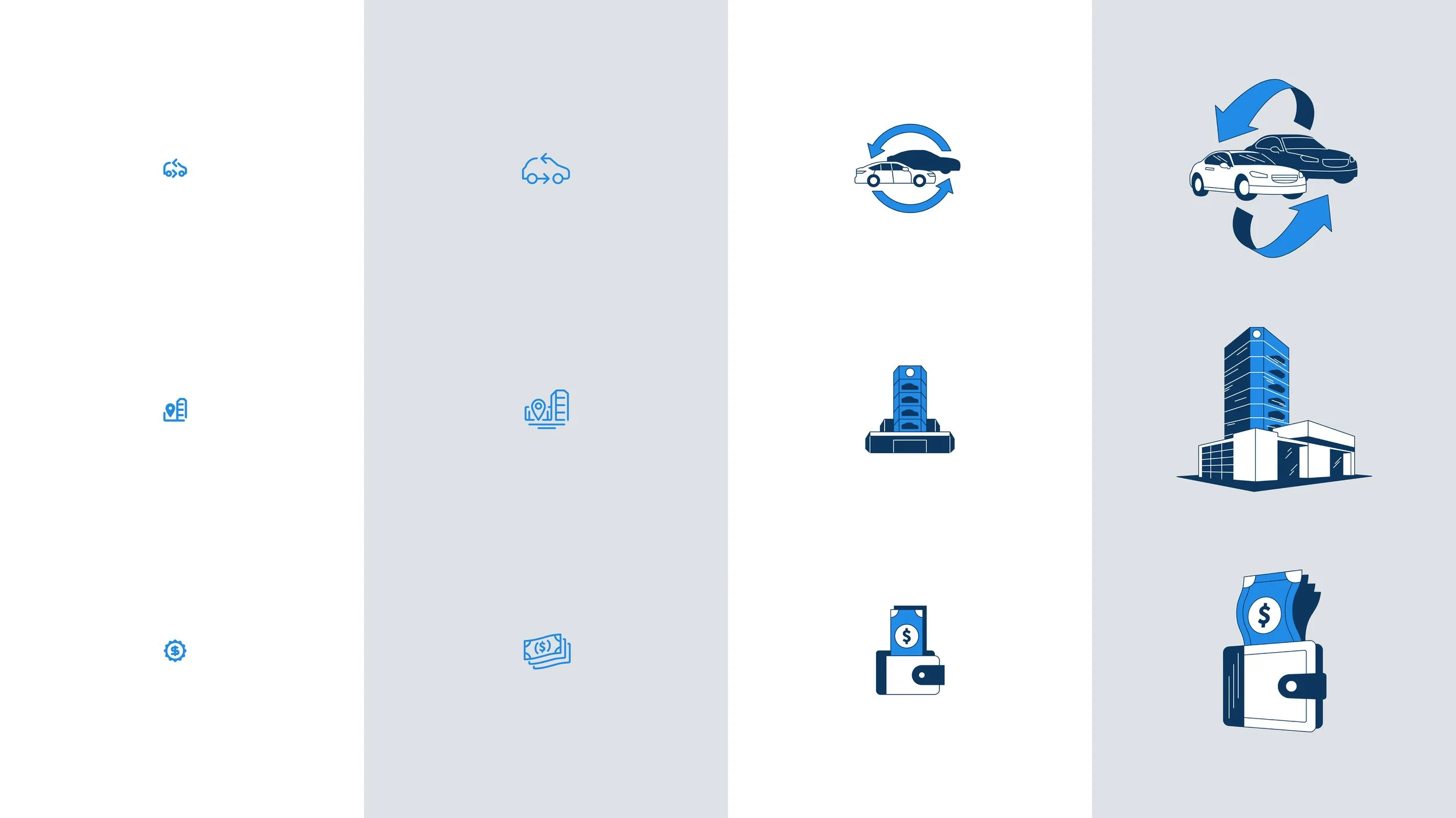
We realized after conducting our brand audit that there was an opportunity gap within our current illustration system. With only 2 levels of illustration at our disposal, this lack of scalability ultimately meant leveraging the same exact illustrations to simultaneously represent a wide array of concepts. Without a defined POV, guidance on usage, and inconsistent scaling, our illustrations—though ubiquitous in sheer number—became less meaningful and intentional. This created a murky brand narrative and an inconsistent product experience for the customer.
Execution
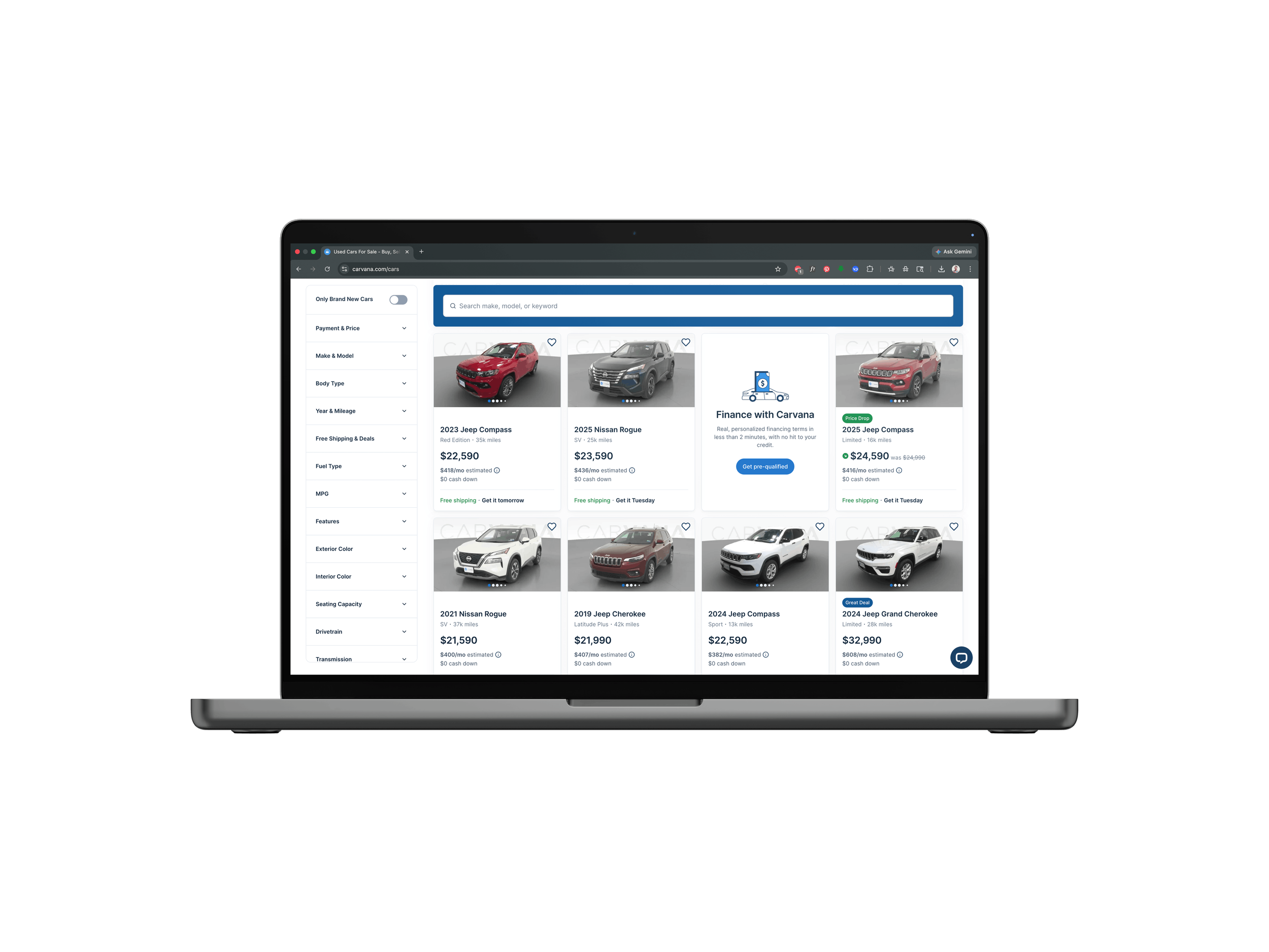
Two net new levels of illustrations were ultimately created to be used within the product space. These Product Illustrations directly addressed the gap in our existing icon library, by establishing clearer use cases and guardrails from the smallest of icons to large hero graphics. This resulted in visual execution with greater intention, strengthening trust with customers, and clarifying our brand messaging.
KEY ATTRIBUTES
These were the primary qualities that we looked towards as our conceptual North Stars when establishing the new illustration system. This was key in helping us massage the overall look and feel especially in the development phases.
Trustworthy
Approachable
Professional
Intentional
Technical


IMPACT
+28%
OVERALL CLICKS
+288%
CLICKS ON GREAT DEALS
+95%
SAVED SEARCHES
+45%
CLICKS TO TRADE-IN
A/B testing was conducted and closely monitored immediately after implementing the new illustration system. Just within the span of a few months, the data showed measurable and impressive increases in clicks on various tiles within the main Carvana site and vehicle display page. These increases in customer engagement and user experience were a direct result of our brand new illustrations, and validated our initial objective to strengthen and further curate our brand asset library.